Case

Metatable.ai | AI-Powered Backend Builder

Metatable is an AI-powered platform that helps teams turn ideas into backend apps. It generates full tech specs, builds the backend with APIs and database, and even preps prompts for frontend tools like Lovable, Bolt, or v0.

We redesigned the entire experience: simplified the flow, clarified the value, and gave the UI a cleaner, more modern look. The result? A smoother, smarter way to go from doc to deployed backend—with zero code.

/ Product Design

/ Design Systems

/ UX Audit

A clean AI chat interface with the Metatable Assistant logo. The screen shows a prompt asking, “Let’s discuss your project. What’s the main goal of your app?” Below is a text input field with placeholder text suggesting: “Ask metatable to create web game…”, followed by quick-suggestion tags like “Leverage Calculator” and “Create API for a blog”. The background features soft gradients and a minimalist UI.

Task

Metatable already had a working product, but the experience felt overwhelming. The flow was unclear, the UI outdated, and the core value hidden. Our job was to fix that fast.

We focused on:

  • Auditing the full platform UX

  • Removing redundant and distracting features

  • Simplifying the user flow to surface core value

  • Redesigning the interface with a modern, minimal approach

  • Creating a clean design system

  • Delivering everything in just 2 weeks

Metatable Assistant voice input screen showing a recorded waveform with confirm and cancel buttons below. Soft gradient background.

Problem Statement

The platform was built to feel like magic — but looked and worked more like cockpit software. Users were overwhelmed by outdated visuals, unclear flows, and too many unnecessary features. The core value was hidden, and the journey often broke down before key steps were completed.

Screenshot of the original Metatable interface before redesign, showing a dense layout with multiple panels: documentation in markdown, database tables, code editor, and service endpoints. The screen appears cluttered and highly technical.

What we uncovered

🪪 Unclear Flow Logic

Users didn’t know they had to prompt the system to move forward. Key actions were missing clear triggers or feedback.

🌀 Overloaded UI

Too many features, too early. The interface pushed everything at once, making it hard to focus or understand what mattered.

🧭 Weak Onboarding Cues

There were no obvious hints or guidance through the flow — especially during crucial steps like documentation generation.

🎨 Outdated Design System

A design system existed, but lacked clarity, spacing, and visual priorities — making the interface feel dense and hard to navigate.

🚫 No Real User Testing

The team had limited resources, so we ran quick hallway tests to validate assumptions and pinpoint areas of friction

Redesigned Metatable table view showing a clean, minimal interface. The left panel lists database tables, while the right panel displays a structured table with editable fields. A dropdown menu offers options like “Export” and “Delete Table.” Soft gradients and spacing create a modern, user-friendly experience.

Founder Interview

To get a clear picture of how the platform actually worked, we kicked things off with a deep-dive session with the founder. He walked us through the full flow—from onboarding to backend delivery—and explained the product’s internal logic.

This helped us map out the existing system, spot areas to simplify, and finally understand the real value Metatable delivers.

Google Meet logo on a light background with two sticky notes in yellow and orange corners.

Quick Testing & Flow Dissection

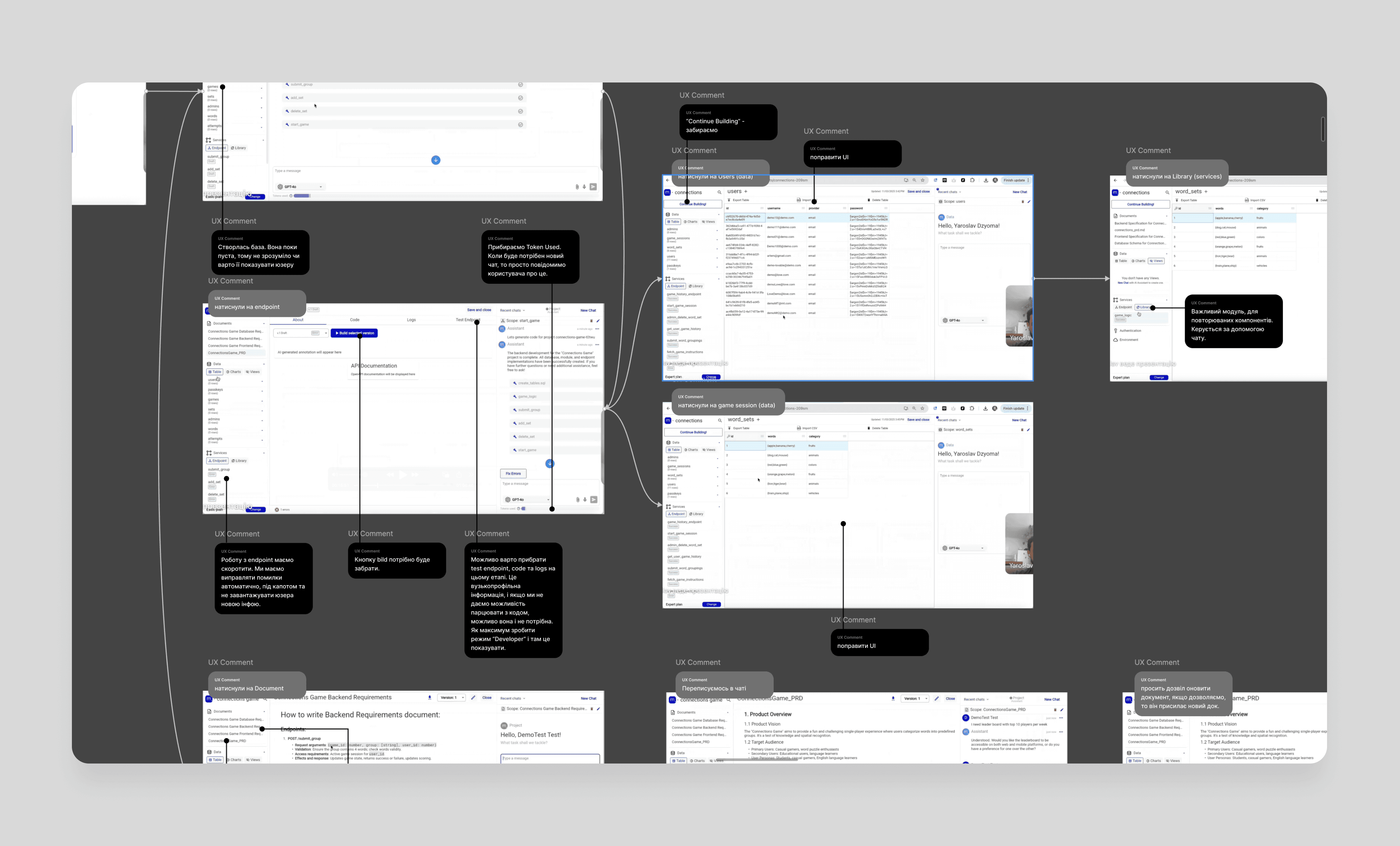
With limited time, we ran quick tests with two users to observe friction points. The main blocker? No one knew how to generate backend docs or where to start.

We mapped the full flow in Figma using screenshots, annotated each step with UX and UI comments, and added sticky notes with high-level design principles. Then we began trimming.

Following Jakob Nielsen’s principle of “Minimalist design”, we removed anything that didn’t support core value delivery. The goal: clarity, speed, and a product that feels as intuitive as Apple.

Figma board with multiple annotated screenshots from a team meeting. Each screen has UX and UI comments in black and grey bubbles, connected by arrows to highlight issues and improvement ideas.

Visual Direction

We gathered references from modern AI tools like ChatGPT, Clay, Superlist, Strut, MyMind and Sana AI to define a new visual style: light, minimal, and human. The goal was to balance tech and magic — making the assistant feel alive, not robotic.

We redesigned everything: typography, iconography, spacing, and layout. Animated gradients added a subtle sense of motion and personality. Each element was crafted to feel universal, soft, and intuitive — not overly technical.

Metatable input screen with a prompt field and a loading message: “Creating Technical Specifications…” on a soft gradient background.

UI Kit

To speed up dev work and ensure consistency across the platform, we built a fresh UI Kit from scratch. We focused on essentials first: colors, typography, buttons, and inputs — just enough for developers to start implementation right away.

We reused some ready-made decisions (like elements from Untitled UI) to move faster, but every component was refined to match the new visual language: light, minimal, and scalable.

Metatable interface showing backend and frontend assignment cards with approval status. Typography and spacing specs are overlaid for design reference.

Designing for Delivery

Instead of starting with low-fidelity wireframes, we went straight into high-fidelity design. It’s how we usually work — it helps us see the real product experience from the start, and in fast-paced projects like this, it saves both time and cost.

We built the entire flow screen by screen — from login to backend deployment — ending up with 50+ production-ready designs. Every screen was carefully reviewed within the design team, validated with stakeholders, and aligned with real user feedback.

Naming layers, organizing files, thinking dev-first — that’s just standard for us.

Metatable project overview screen showing all assignments marked as “Approved.” A “Success” badge is displayed in chat, confirming backend and database setup is in progress. Clean, white UI with soft gradients.
Metatable screen showing an approved Product Requirements Document (PRD). The left panel includes a success message from the assistant, while the right displays structured PRD content with headings and descriptions. Clean layout with minimal UI.

Final Outcomes

📦 What We Delivered

– Clean UI Kit and scalable design system
50+ high-fidelity, ready-to-develop screens in Figma
– Annotated flows and logic behind key user journeys

Metatable password reset screen with fields for new and confirmed passwords, password requirements checklist, and a “Reset password” button. Minimal design with soft gradient background.

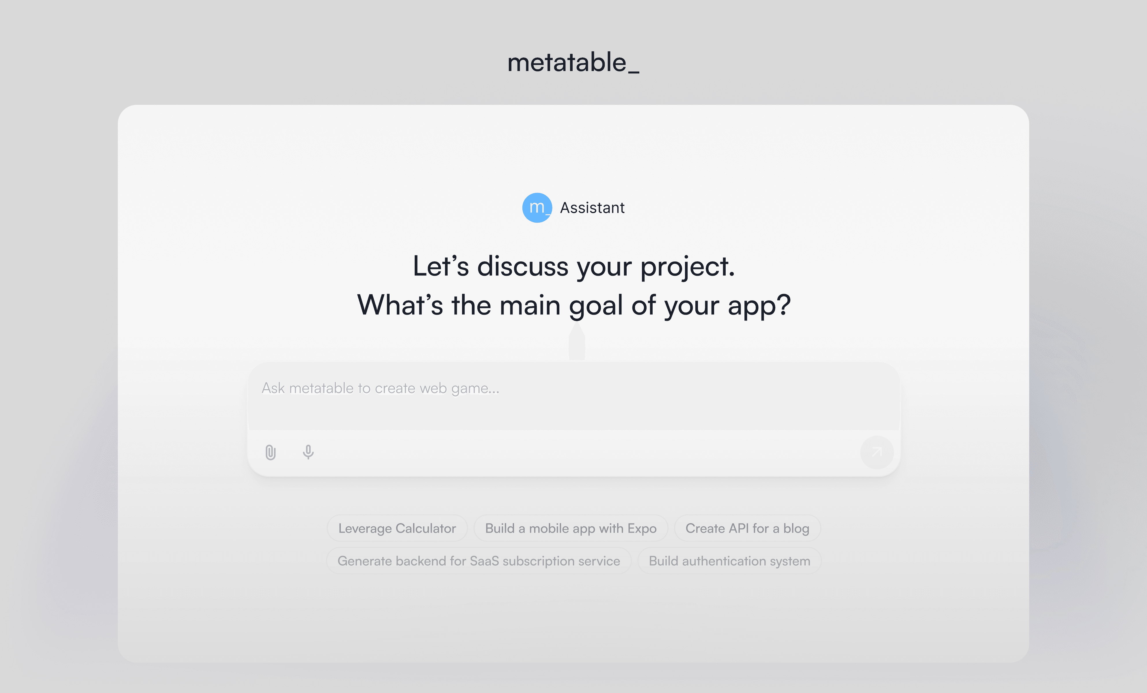
💬 Instant Onboarding

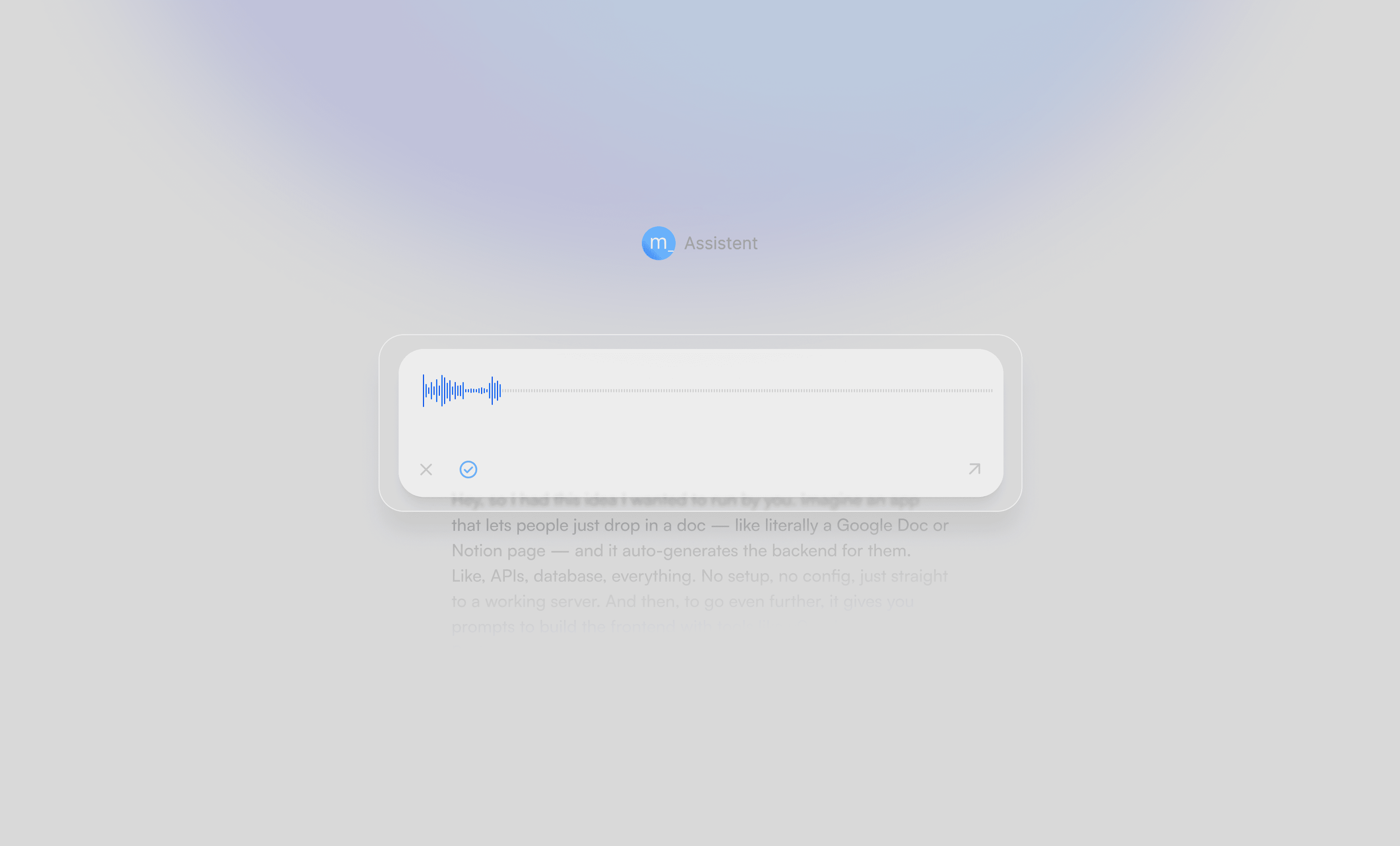
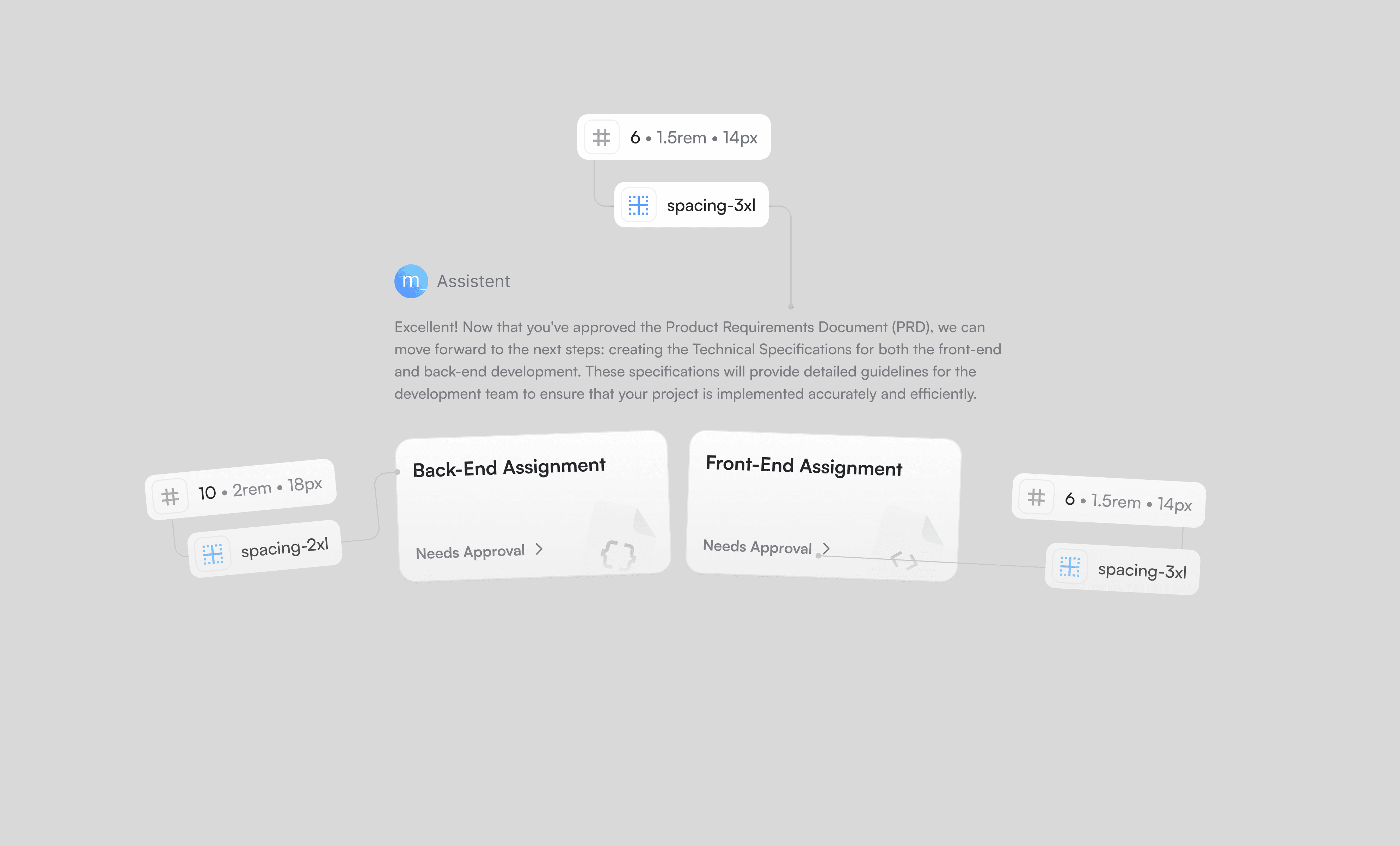
We redesigned the entry point to start with chat — showing value immediately. No more complex steps or guesswork. Just type, and the product responds.

A clean AI chat interface with the Metatable Assistant logo. The screen shows a prompt asking, “Let’s discuss your project. What’s the main goal of your app?” Below is a text input field with placeholder text suggesting: “Ask metatable to create web game…”, followed by quick-suggestion tags like “Leverage Calculator” and “Create API for a blog”. The background features soft gradients and a minimalist UI.

🎨 Clean, Modern Interface

We simplified the color palette, increased negative space, and used clear typography for hierarchy. The result is a calm, focused UI that feels easy to use.

Metatable API panel displaying details for the selected game_history_endpoint. The right side shows endpoint description and documentation, while the left lists other available endpoints. Clean, structured layout for developers.

⚙️ Smarter UX, Less Noise

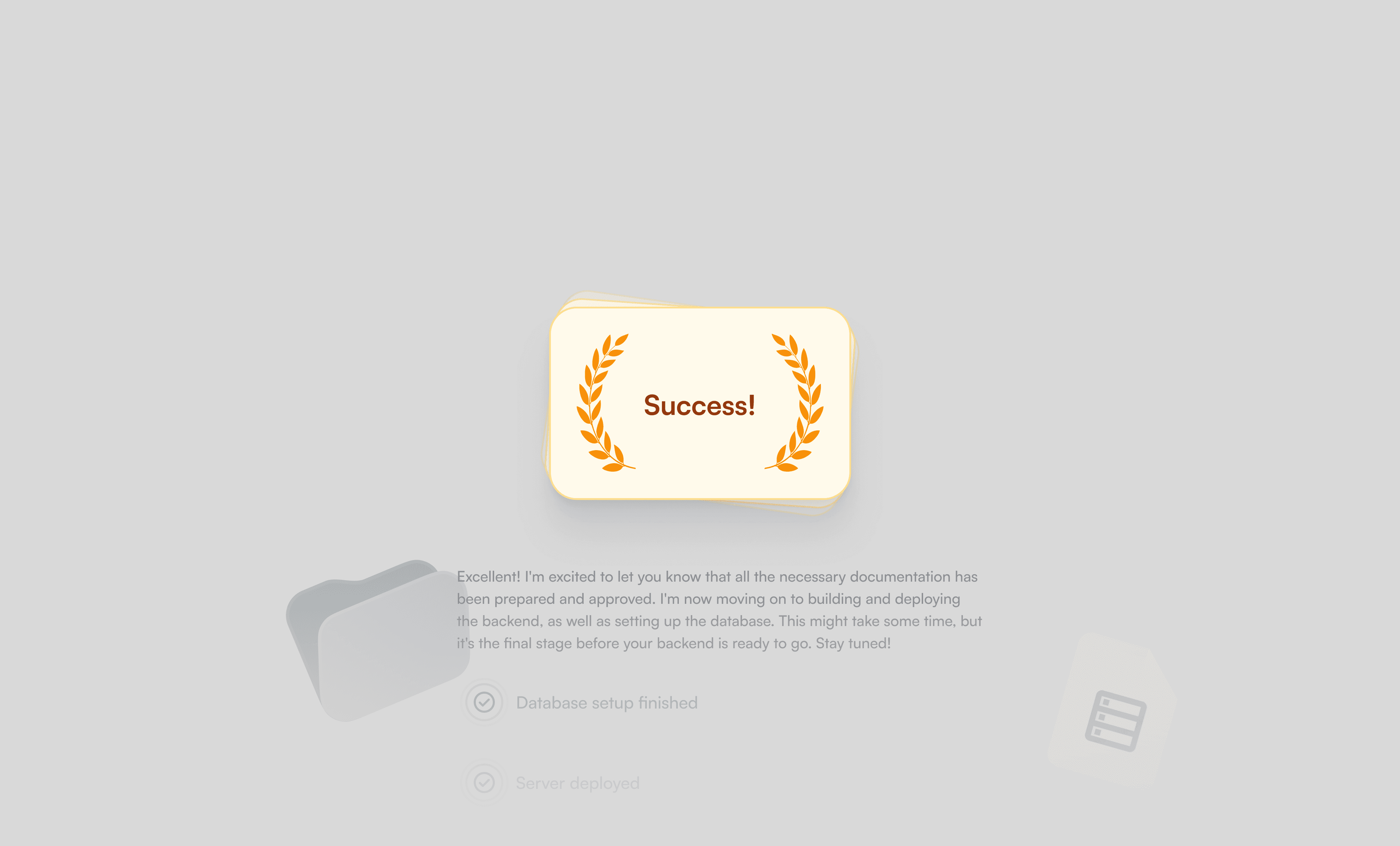
We stripped away secondary features and restructured the flow around core tasks. The chat now guides the user, explains next steps, and confirms progress automatically.

Centered “Success!” badge with laurel icon on a grey background. Below it, a confirmation message indicates that the backend and database setup has been approved, with progress indicators for database and server deployment.

🧠 Invisible Automation

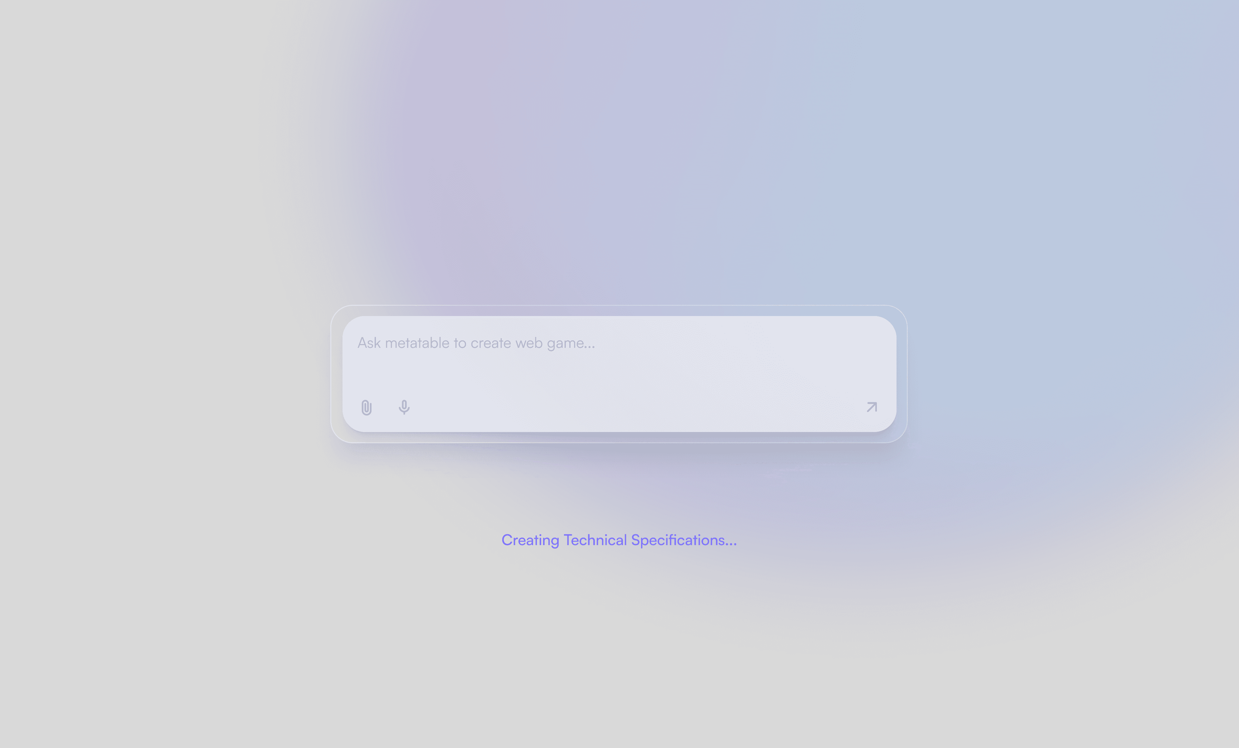
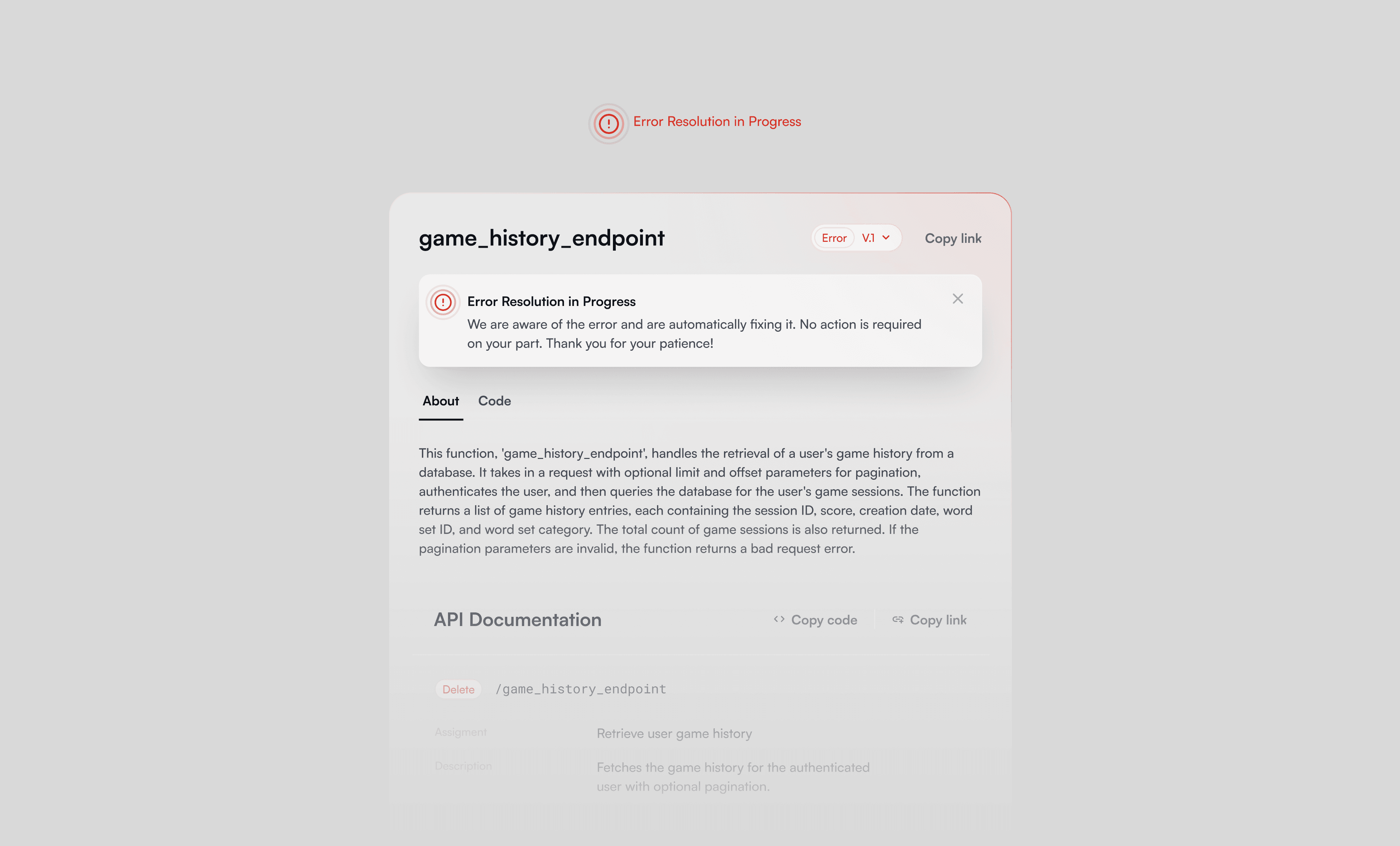
We hid the complexity. Most technical processes now run behind the scenes — users just see results, not config options.

Metatable error screen for game_history_endpoint showing a red warning banner labeled “Error Resolution in Progress.” Message indicates the issue is being fixed automatically with no user action required. Clean layout with error styling.

Impact & Takeaways

🧩 Real Teamwork

Tight deadlines and personal commitments made this project intense — but that’s where teamwork shows up. We backed each other up, worked weekends when needed, and got it done.

🧠 Rethink Early, Not Late

If something isn’t working — don’t be afraid to flip the table. It’s way easier to rebuild early than to patch later. Especially when the decisions are grounded.

🚀 A Clearer Path for Users

Now the product speaks for itself. It’s focused, guided, and delivers value from the first click — exactly what early-stage AI tools need.

🔥 We Love This Kind of Work

Fast, high-stakes, product-driven. That’s our zone. Call us when you need to move fast and make it real.