Case

SignFlow | Document Management

SignFlow is a document management system designed to make signing and handling documents effortless. The platform enhances usability by simplifying workflows, reducing friction, and ensuring a smooth document flow.

Note: Due to an NDA, the project name, logo, and some key screens have been modified.

/ Product Design

/ Design Systems

/ UX Audit

Dashboard view for project ‘Save Alaska’ showing document stats, signing percentages, contact groups, and weekly signing chart.

Task

We conducted a UX audit, built a modular design system, and designed 15+ high-fidelity screens—all within just one month. Our focus? Speedclarity, and scalability.

What we delivered:

  • A UX audit that uncovered key usability issues.

  • A scalable, component-based design system.

  • Redesigned and refined core user flows and screens.

  • Rapid prototype testing to quickly validate usability.

UI focus on ‘Documents Status’ donut chart with document categories and a progress bar showing daily signing goal. Background shows contact groups and weekly signing graph.

Problem Statement

The client came to us with a clear goal: simplify complex workflows that users found confusing on competing platforms. While the core functionality was solid, the interface lacked structure and clarity. Our role was to audit the experience and build a cohesive system based on UX best practices.

What we uncovered

🧱 No Design System

UI components and interaction patterns were inconsistent, making the product feel fragmented and hard to scale.

📊 Weak Visual Hierarchy

Key project stats and statuses were hard to scan—hurting the dashboard’s overall usability.

🧭 Cluttered Navigation

Users had to dig through repetitive, unclear menus just to complete simple tasks.

🔍 Limited Search & Filtering

Search lacked flexibility, especially for users working with large volumes of content.

⚙️ Unfriendly Automation Settings

The automation engine was powerful—but too technical. Most users found the settings overwhelming and avoided using them altogether.

Analytics card showing 2,420 total documents with a 40% increase vs last month and a rising trend line.”

UX Audit

We ran a heuristic analysis of the core user flows—focusing on visual hierarchyaccessibility, and clarity of purpose. Our main goal was to reduce cognitive load by simplifying on-screen decisions and making essential actions feel intuitive and contextual.

To guide the process, we used Jakob Nielsen’s usability heuristics to evaluate and restructure the interface with a strong foundation in best practices.

UX audit checklist with grouped categories like Navigation, Interaction, Feedback, Visual Hierarchy, and Forms, each containing actionable review points.

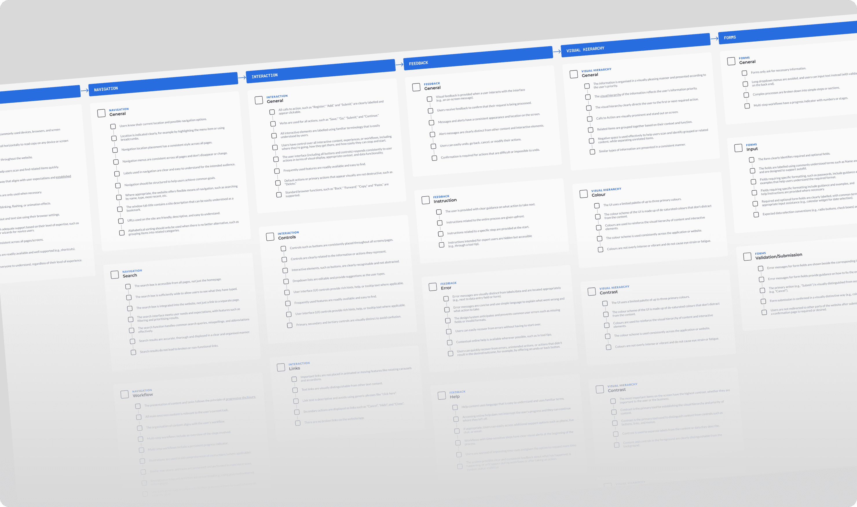
Wireframe & Structure Analysis

The client provided low-fidelity wireframes and documentation outlining desired features. I analyzed each screen’s intent, redefined priorities, and mapped a clearer interaction flow to better match user goals.

Wireframe screens showcasing data entry forms, user permissions, automation settings, and contact information layout in a web platform

UI Kit & Design System

We created a modular design system to bring consistency, reduce design debt, and speed up both design and development.

This solved several key challenges:

  • Eliminated UI inconsistencies across screens and states

  • Accelerated design and development cycles

  • Enabled smooth integration of new features without breaking visual or functional coherence

  • Improved clarity during handoff between design and development teams

For a product like SignFlow—where multiple document types, user roles, and states must coexist—a robust design system, it's essential. It ensures long-term efficiency, reduces decision fatigue, and allows the team to scale the product with confidence and speed.

UI kit showcasing spacing guides, date picker, typography scale, success color palette, and labeled design tokens for consistent styling.

Final Outcome: Highlights

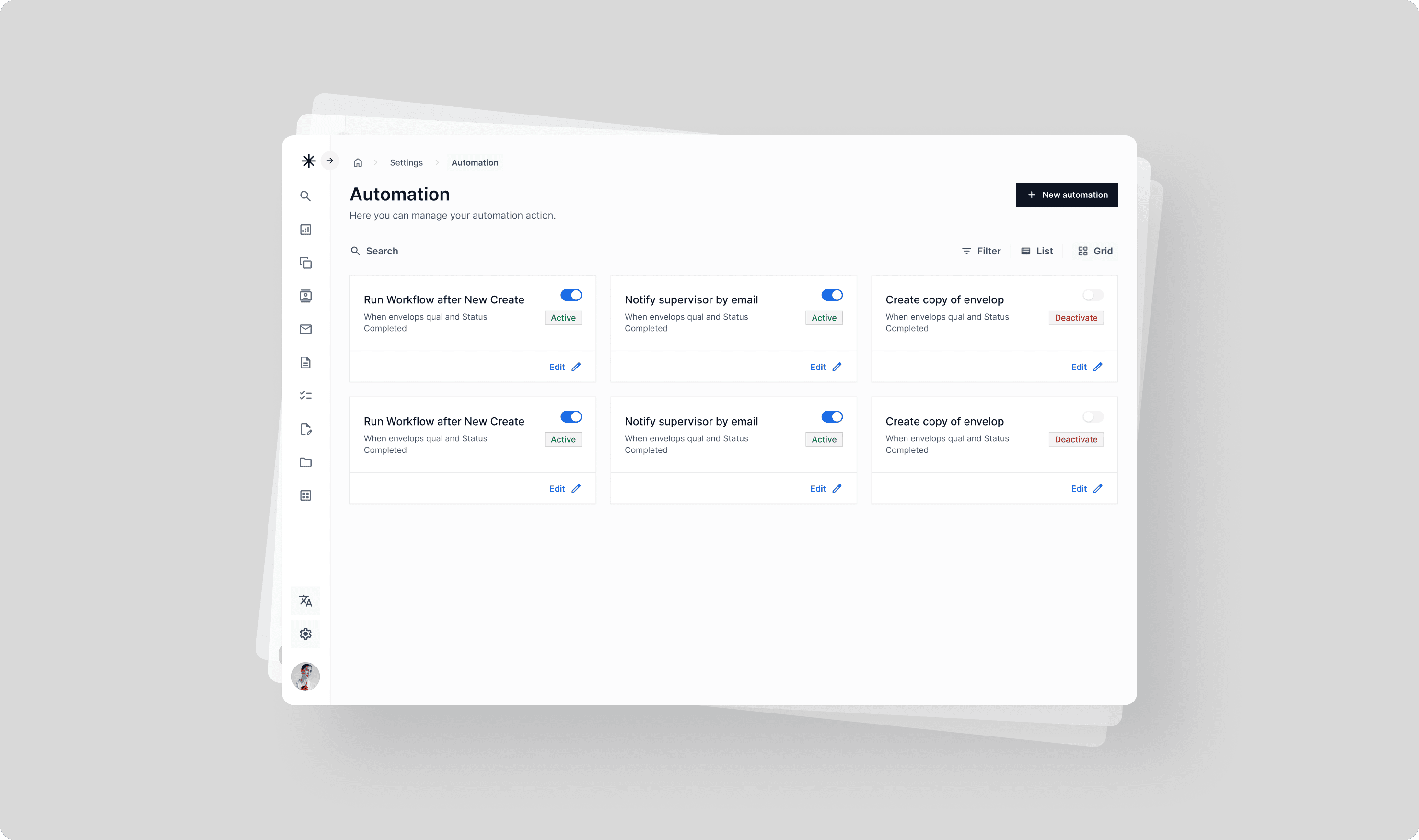
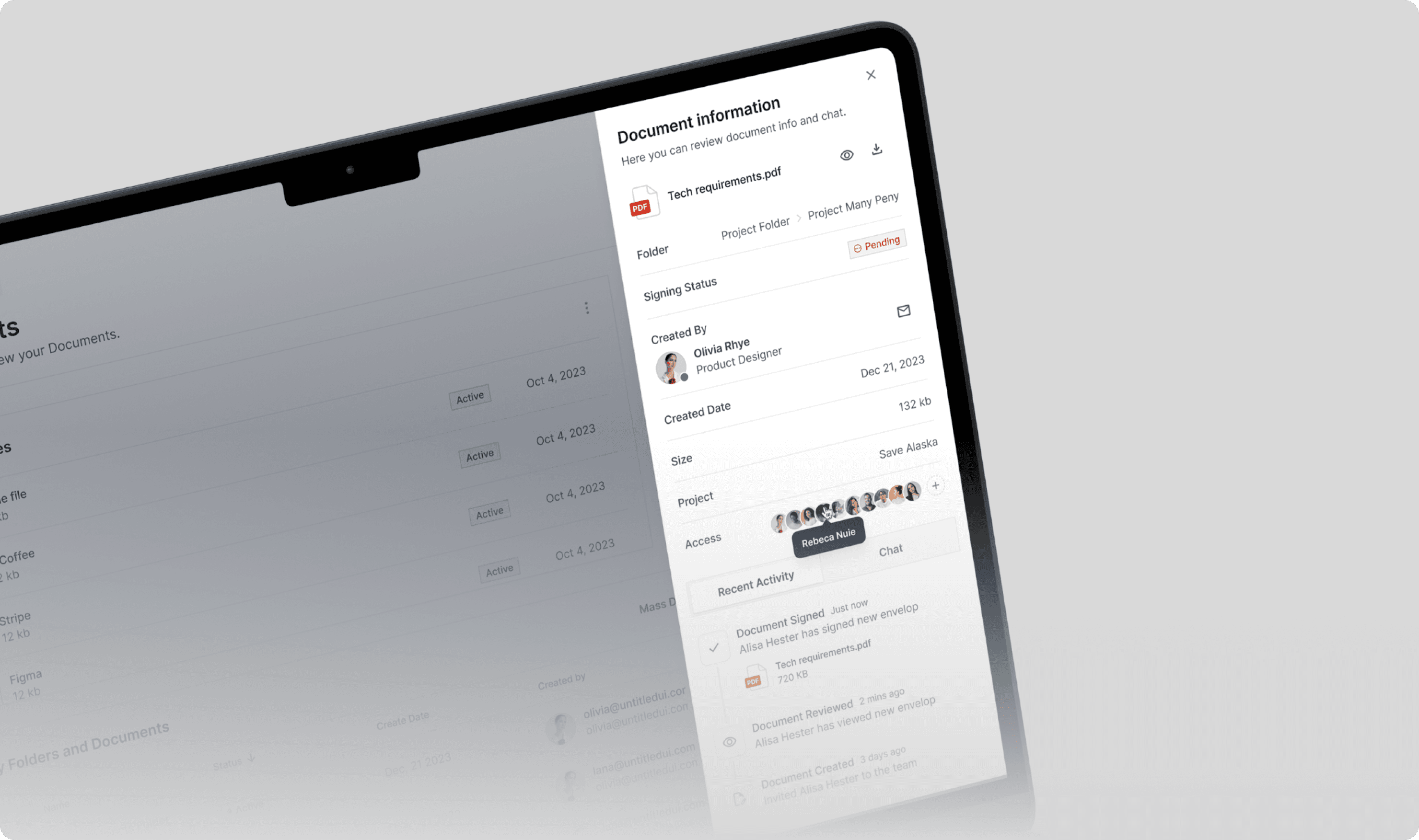
📊 Data-Driven Dashboard

We designed the dashboard around data visualization best practices, surfacing key metrics at a glance. The result? Faster insightsimproved scannability, and better decision-making for users.

Dashboard overview for “Save Alaska” project showing document metrics, progress flow, donut chart, bar graph for views, and contact group list.

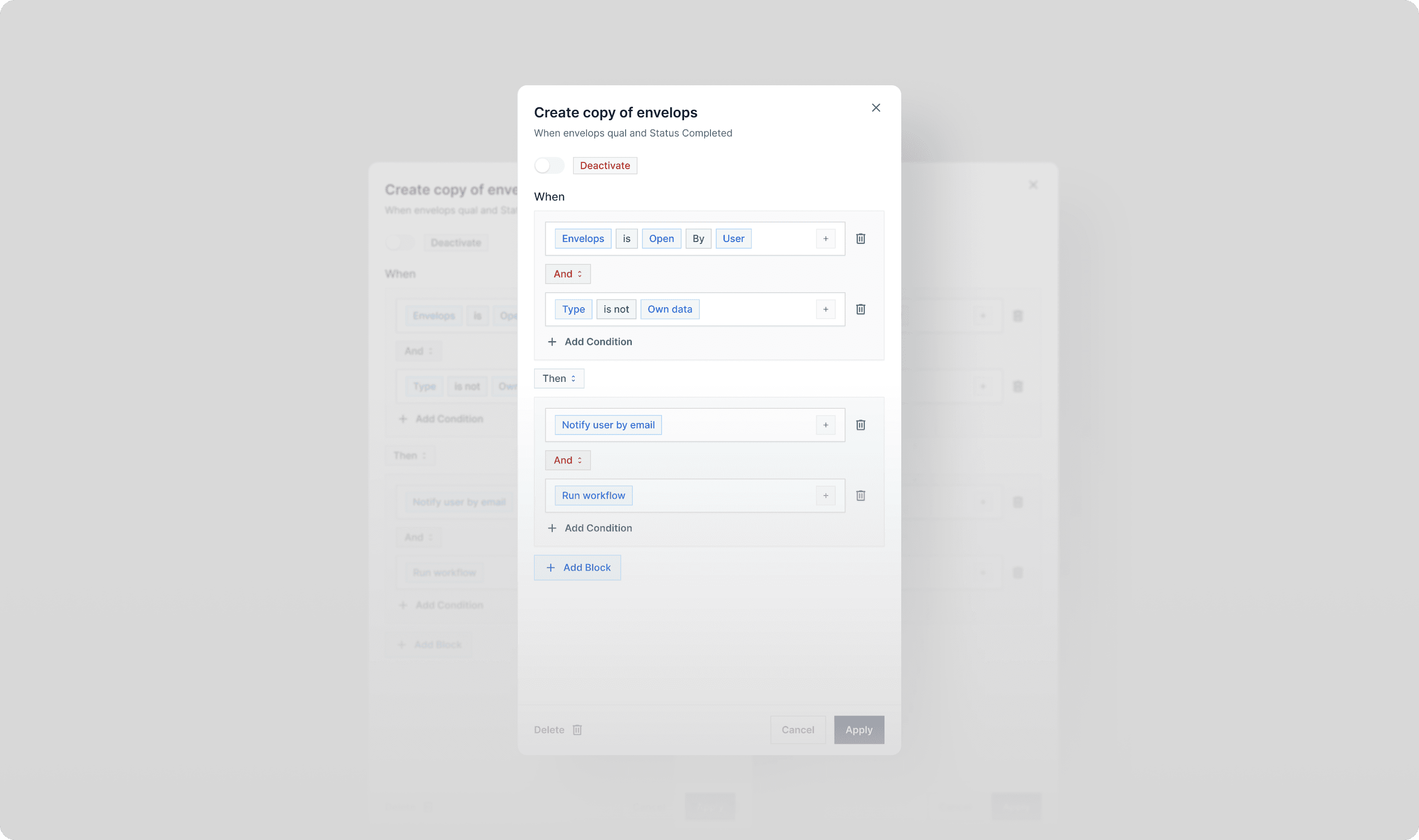
⚙️ Automation via Faceted Logic Blocks

We designed a modular “When–Then” logic system that lets users build custom automations with ease. Each logic card uses two intuitive inputs, following a faceted navigation pattern commonly seen in advanced filtering—making complex workflows feel simple, scalable, and approachable.

Automation settings screen displaying a list of workflows with toggle switches, status indicators, and edit options for each automation rule.
Modal view for editing automation rule with conditional logic blocks, toggle for activation, and actions like email notification and workflow trigger.

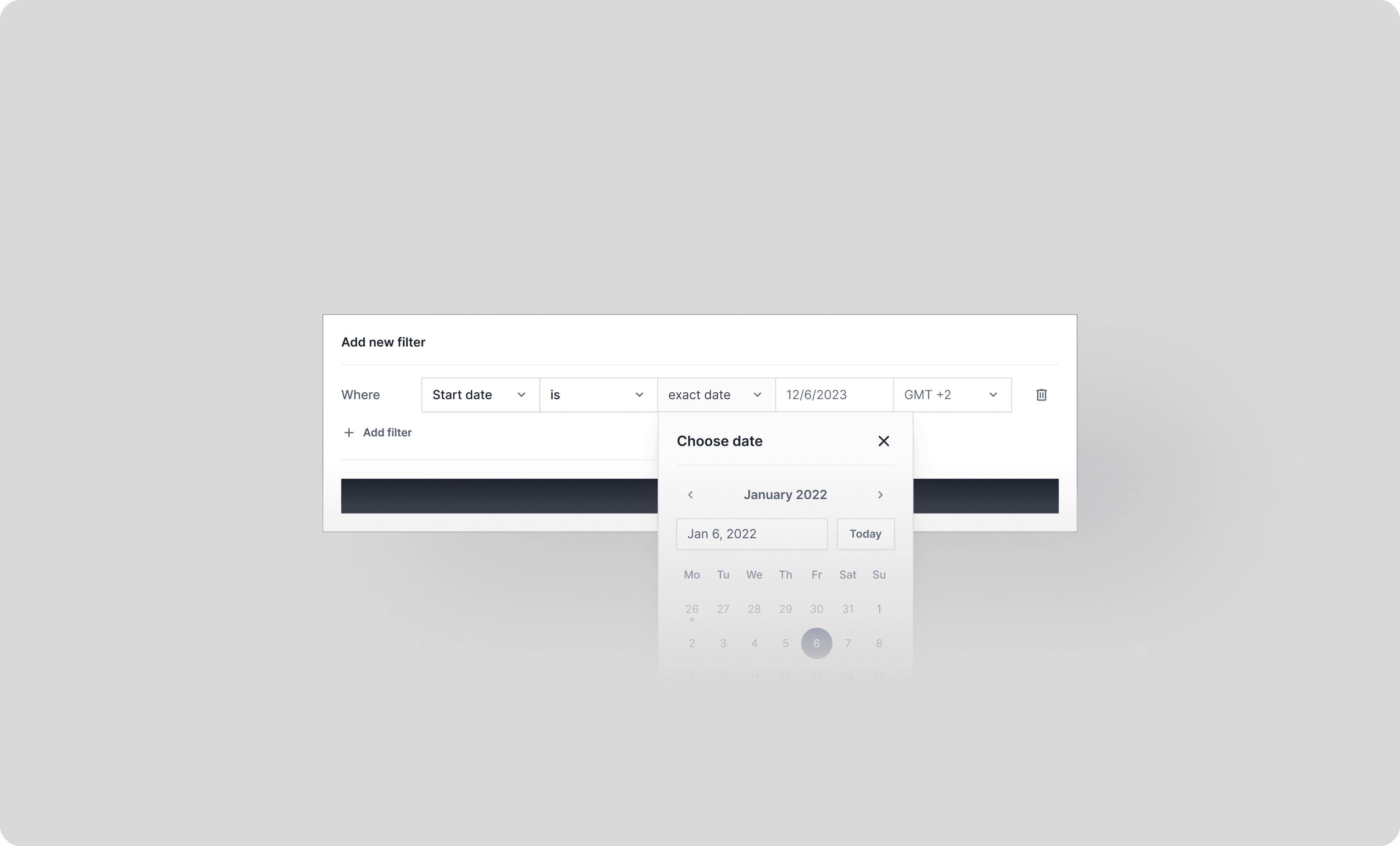
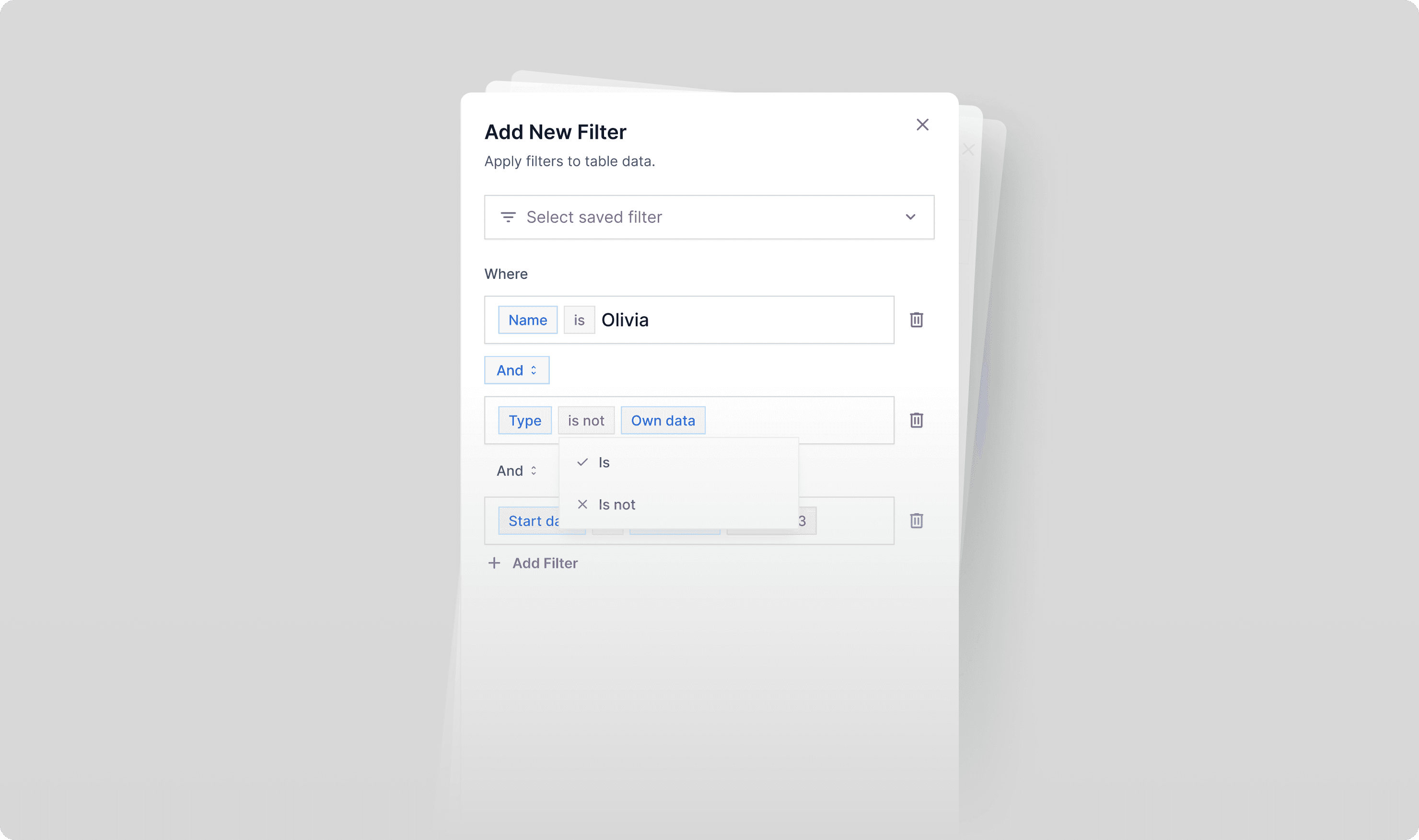
🔍 Search with Custom Filters

We added a secondary search and filtering system based on user-defined parameters. This filter builder mirrors the automation logic UI, reinforcing mental models and maintaining consistency across advanced controls.

Date filter UI with dropdown controls and a calendar popover for selecting exact start date and time zone.
Filter creation modal with multi-condition logic builder, allowing rule customization using dropdowns, text inputs, and field-specific operators.

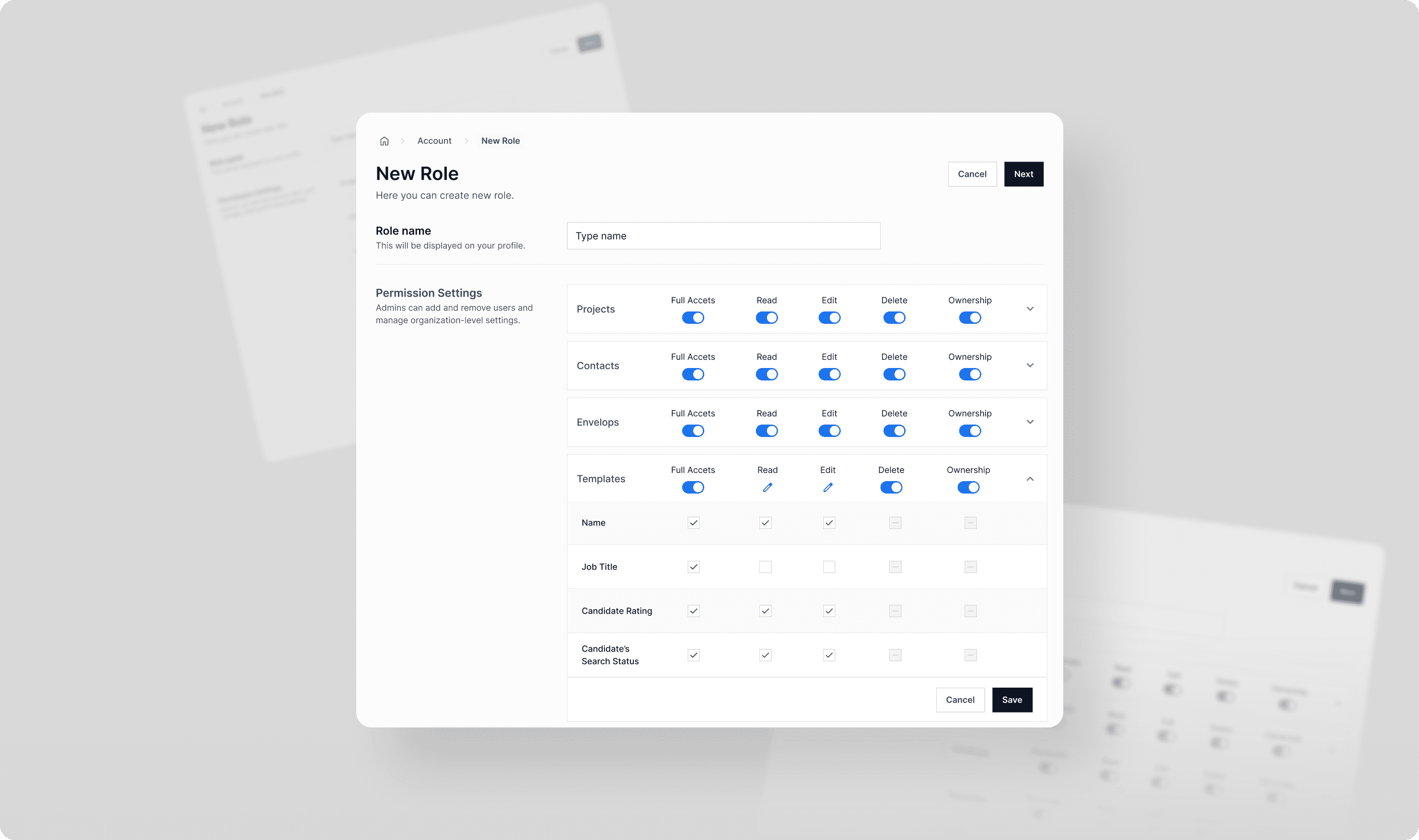
🛠️ Role Configuration with Smart Toggles

To support advanced role management, we introduced smart toggles with contextual behavior. Manual overrides instantly convert toggles into editable fields, visually marked with a pencil icon. This hybrid control improves clarity and makes user intent unmistakable—no guesswork required.

New role creation screen with permission matrix for projects, contacts, envelopes, and templates, allowing toggles for full access, read, edit, delete, and ownership.

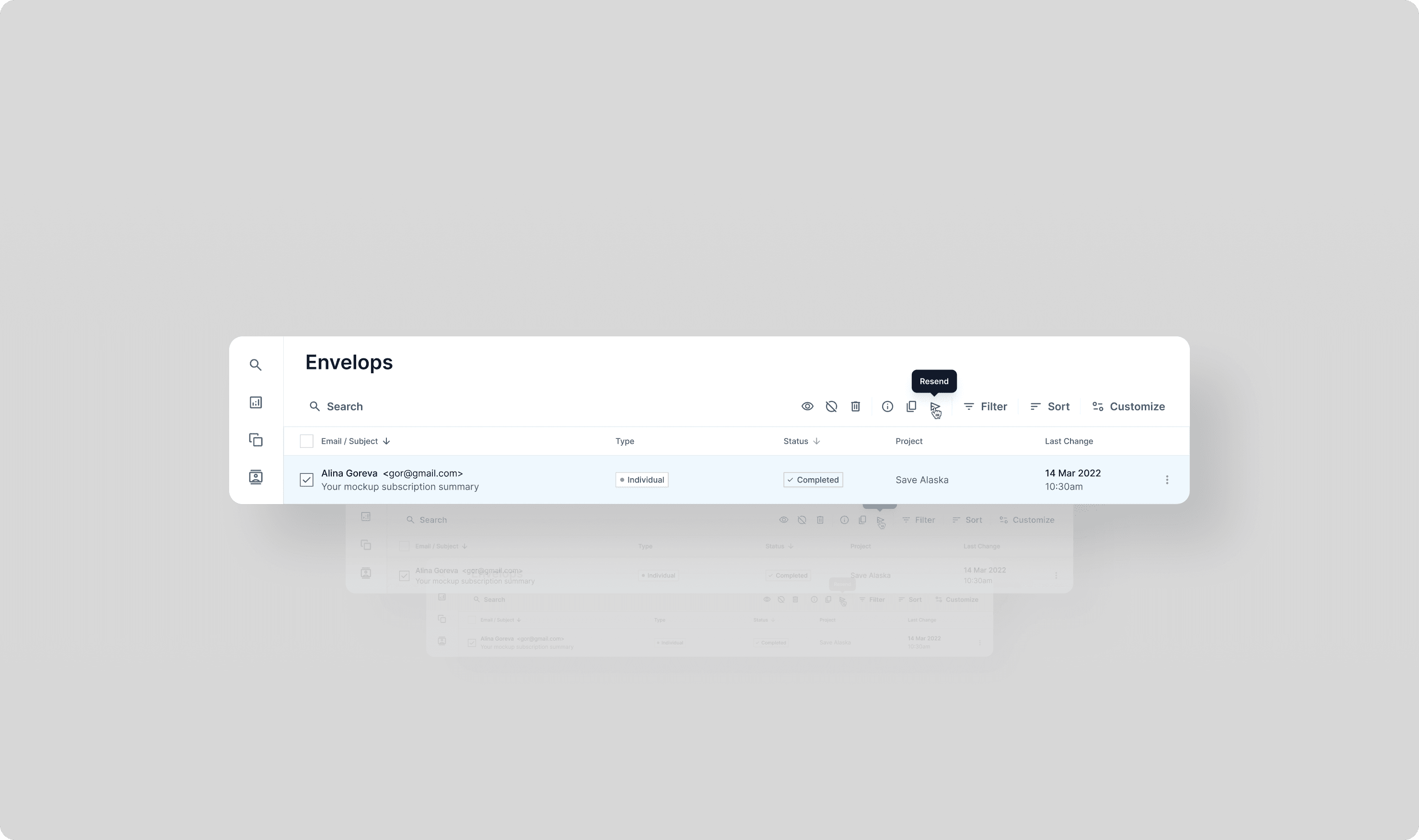
🧾 Quick Actions for Tables & Envelopes

We added a compact control panel directly into tables and envelope listings to streamline workflows. This minimized interaction cost and enabled fast, in-context actions—fully aligned with Fitts’s Law and efficiency-first UI principles.

Envelope list UI showing email subject, sender, status, project tag, last change date, and action bar with options like resend, filter, sort, and customize.

Validation

With limited resources, we ran corridor usability testing with internal stakeholders. Feedback confirmed we were on the right track—no major usability issues emerged, and all interactions were understood without explanation. A strong signal that the interface achieved the desired clarity.

Impact

Although I was not involved in the post-launch phase, the work delivered laid a strong foundation for successful implementation and scaling:

  • Faster Handoff: Dev-ready design system and components.

  • Improved Usability: Simplified flows and more intuitive structures.

  • Ready for Scale: System built to support future roles, automation logic, and search use cases.

Document info panel on a tablet showing PDF details, status, creator, date, size, project name, shared users, and recent activity with chat option.

Next Step

  1. Run moderated usability testing with real users to gather deeper insights.

  2. Integrate analytics to track key interaction patterns and identify friction points.

  3. Expand the design system to support upcoming features and modules.

  4. Enhance accessibility, focusing on screen reader support and keyboard-only navigation.