Case

Kiite | Community Management

Kiite is a platform that empowers community managers and users to forge meaningful connections through advanced AI-driven search and interaction technologies.

/ Product Design

/ Design Systems

Mission

We believe the future of networking lies in tight-knit communities, not broad social graphs. Our primary users are professional groups—developers, venture investors, and others—who rely on relevance and shared context over volume.

Kiite community platform interface showing member profiles with tags like “Worked with you,” “Let’s Connect,” and “Need help,” alongside search, filters, and interaction buttons.

Task

Our objective was to develop and test a comprehensive design for the entire application, focusing on the following key areas:

  1. Create a Scalable Design System: Establish a cohesive and adaptable design framework to ensure consistency across the application.

  2. Develop and Test the Onboarding Process: Design and implement an efficient onboarding flow to guide new users through the application seamlessly.

  3. Design Intuitive User Interface and Flow: Enhance the search functionality and user connections by creating an intuitive and user-friendly design that optimizes user experience.

  4. Develop a Generative CV Feature: Implement a feature that generates user profiles based on LinkedIn data, streamlining the profile creation process.

  5. Build a Simple Landing Page Builder for Communities: Create an easy-to-use tool that allows communities to build and customize their landing pages effectively.

Magic Search results with user cards filtered by “San Francisco, CA,” highlighting personal match traits and relationship tags like “Worked with you” and “Need help.”

Problem Statement

Know Your Group was originally designed to simplify searching within group chats. However, its outdated interface and complex user flow made it difficult for new communities to engage with the platform. This friction not only hindered user adoption but also limited KYG’s ability to attract new investment rounds and onboard more communities. To scale effectively, we needed to completely redesign the user experience, rebuild the onboarding flow, and establish a cohesive design system that ensures consistency and ease of use.

Help request card highlighting a user’s need for legal, tax, and investor support in EdTech, with tags and a CTA button labeled “I can help.”

Breakdown of the problem

🔍 Limited Scalability

The original product was not designed for multi-community environments or large user bases, resulting in performance and UX bottlenecks

🔗 Fragmented User Experience

Features worked in isolation without a unified flow or shared language, making onboarding and daily use disjointed.

⚠️ Confusing User Flow & Onboarding

Over time, functionality was added without proper IA planning. This led to confusing navigation, unclear actions, and cognitive overload.

📄 Manual and Time-Consuming Profile Creation

Users had to manually input data to create their profiles, which discouraged adoption. Without an automated way to pull relevant information (e.g., from LinkedIn), the process felt tedious and inefficient.

🎨 Outdated and Uninviting Interface

The interface was built on outdated UI patterns, lacked responsiveness, and failed to meet modern usability standards—especially on mobile.

Search filter UI showing country-of-origin tags with “Is originally from Ukraine” selected, part of a magic search interaction.

Methodology

Our process was lean, iterative, and insight-driven.

  • We began with stakeholder interviews to extract key business goals and user needs.

  • Conducted secondary UX research, using feedback from current communities to inform personas.

  • Created user flows and low-fidelity wireframes, testing multiple versions for each screen.

  • Applied heuristic evaluation and lightweight usability tests to validate assumptions.

  • Iterated rapidly based on team feedback and emerging product constraints.

  • Managed the workflow without a project manager, organizing sprints, syncs, and documentation internally.

Secondary UX Research

Due to limited resources, we couldn’t conduct a full-scale UX research process. Instead, we focused on secondary research to gather insights efficiently and inform our design decisions.

🔍 Stakeholder Interviews

We engaged with key stakeholders to understand KYG’s existing user base and the types of communities using the platform. These discussions helped us identify pain points and opportunities for improvement.

💬 Client Feedback & User Insights

To validate our assumptions, we collected feedback from current clients and community managers. Their input provided valuable insights into user behavior, challenges, and expectations.

👤 Creating User Personas

Based on the gathered insights, we developed user personas to represent different types of KYG users. These personas helped us align the design with real user needs and prioritize features that improve engagement and usability.

By leveraging secondary research, we ensured that our design decisions were data-informed and user-centric, even within resource constraints.

Persona card for “Pluto” showing user photo, personality traits, goals, issues, and potential impact, used for UX research and design alignment.

User flow

With the insights from our secondary research, we developed a streamlined user flow to improve navigation, enhance engagement, and simplify key interactions within the platform.

User flow diagram with interconnected red cards representing steps like community creation, platform connection, landing page setup, and analytics tracking.

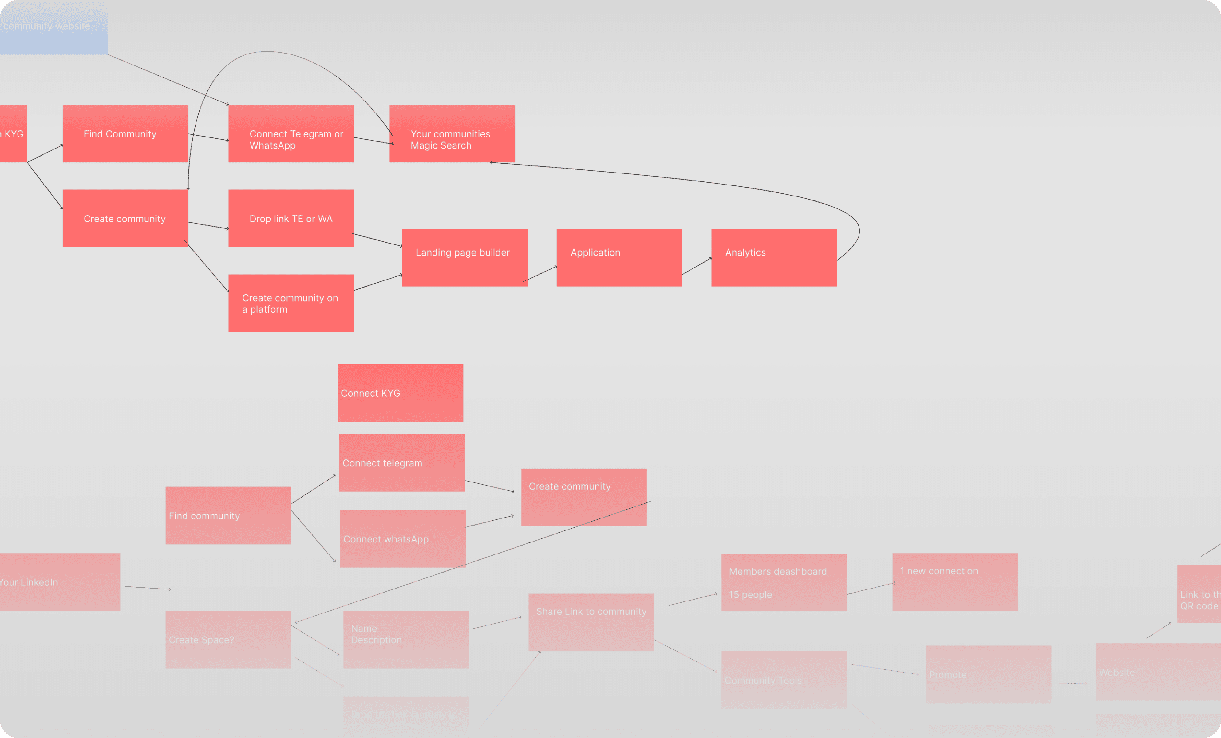
Iterating through multiple low-fidelity wireframes

Building on the improved user flow, we created low-fidelity wireframes to visualize core interactions, test usability concepts, and iterate quickly before moving into high-fidelity design.

Wireframe screens for KYG community platform showing dashboard, member profiles, connection tags, community feeds, and detailed user cards with interests and support needs.

Final Outcome: Highlights

Each highlight captures an aspect of the new experience.

It calls out which design goal it adheres to, what user scenario or problem its solving and what the solution is.

Confirmation screen with animated checkmark and sparkles, displaying the message “Your community is set up!” to indicate successful onboarding.

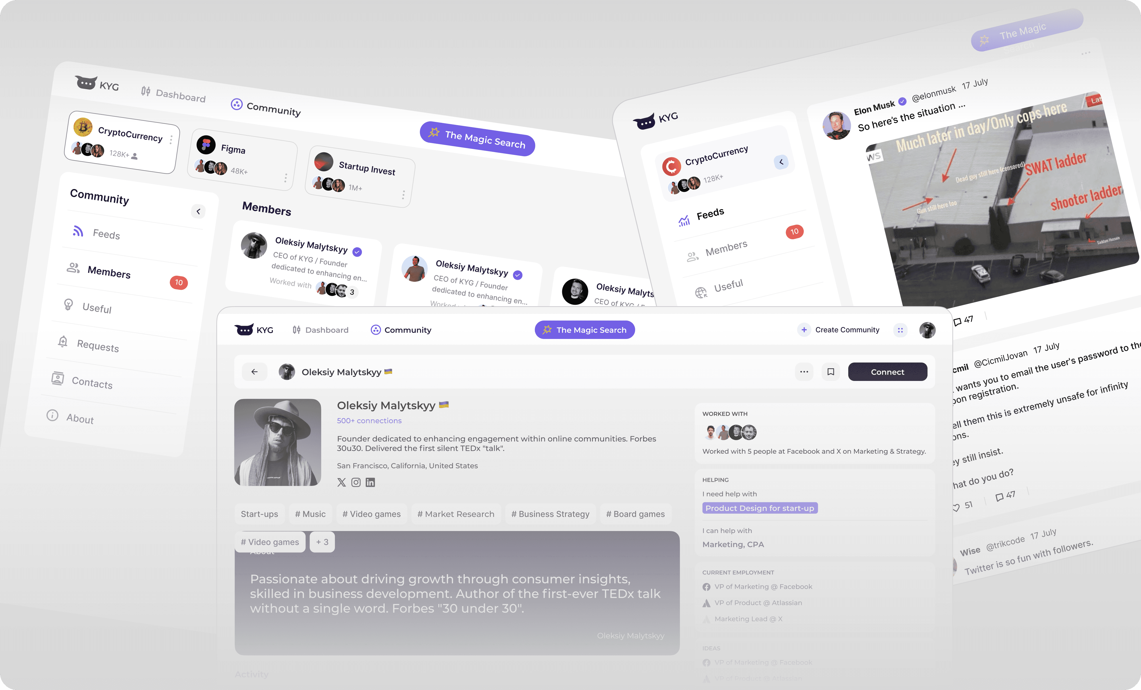
🌍 Dedicated Community Space

We introduced a community space where users can explore and join different communities. To create a clear distinction between personal and community environments, we removed the sidebar, ensuring users immediately recognize they have entered a new section.

Community discovery page for Kiite platform displaying featured spaces with thumbnails, member and connection counts, and "Join community" buttons under a Magic Search bar.

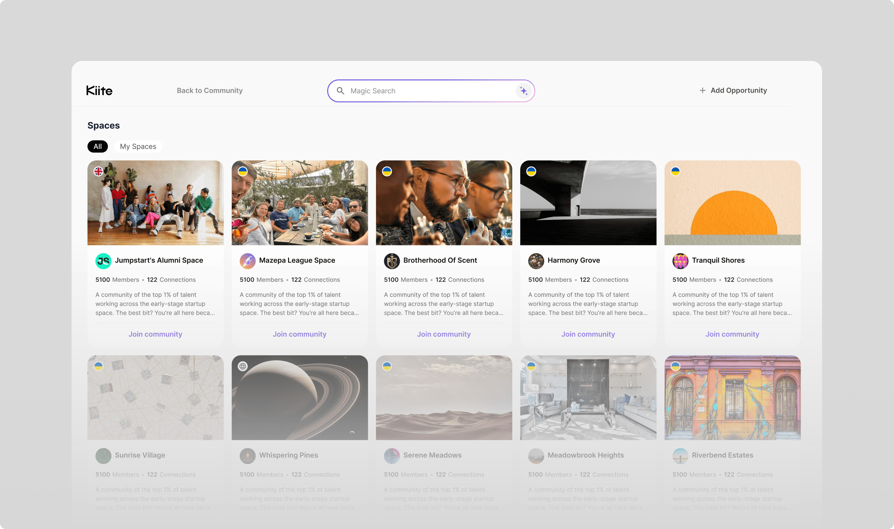
📌 Optimized Community Cards with Dynamic Details

We designed community cards to be informative yet space-efficient, displaying key details like country, common members, and a brief description. To maintain a clean layout, we used hover-based micro-animations that reveal additional details dynamically, keeping the design visually appealing while ensuring easy access to relevant information.

Animated community card for “Whispering Pines” showing a planet-themed image, member and connection count, brief description, and a “Join community” CTA.

🔄 Sidebar Prototype for Easy Community Switching

We created a sidebar prototype to allow users to easily switch between communities. This provides a streamlined way for users to navigate through different groups without losing their place or context, enhancing overall usability.

Animated mobile sidebar showing space navigation with section headers, unread indicators, and user profile at the bottom for quick space switching and management.

🎬 Micro-animations

We incorporated micro-animations to enhance the user flow and overall satisfaction. These subtle animations provide dynamic feedback, guiding users through interactions and making the experience feel more intuitive and engaging without overwhelming the interface.

Micro-interaction animation of a user card confirming a connection with a sparkling checkmark after selection, enhancing feedback and engagement.

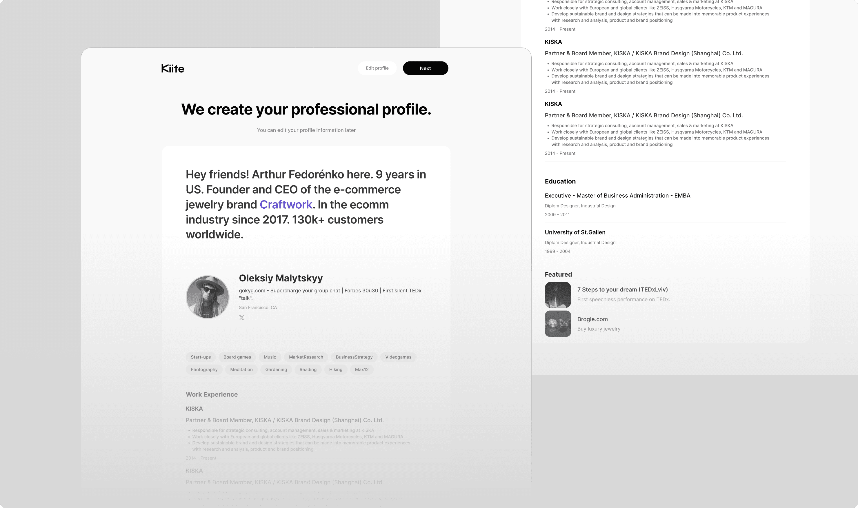
🕺 Minimalistic & Professional CV

We designed a minimalistic and professional CV for user profiles, focusing on clean lines and essential information.
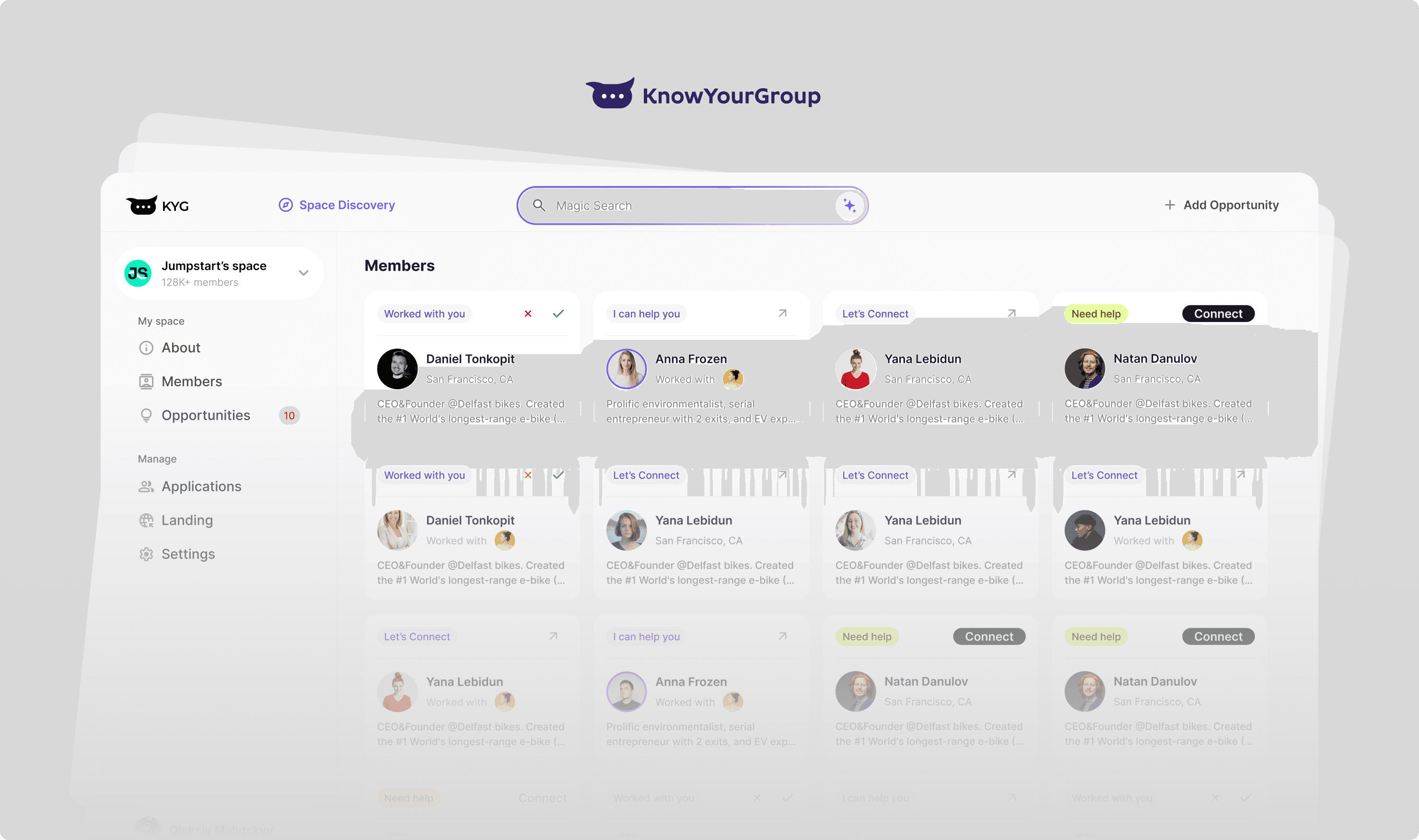
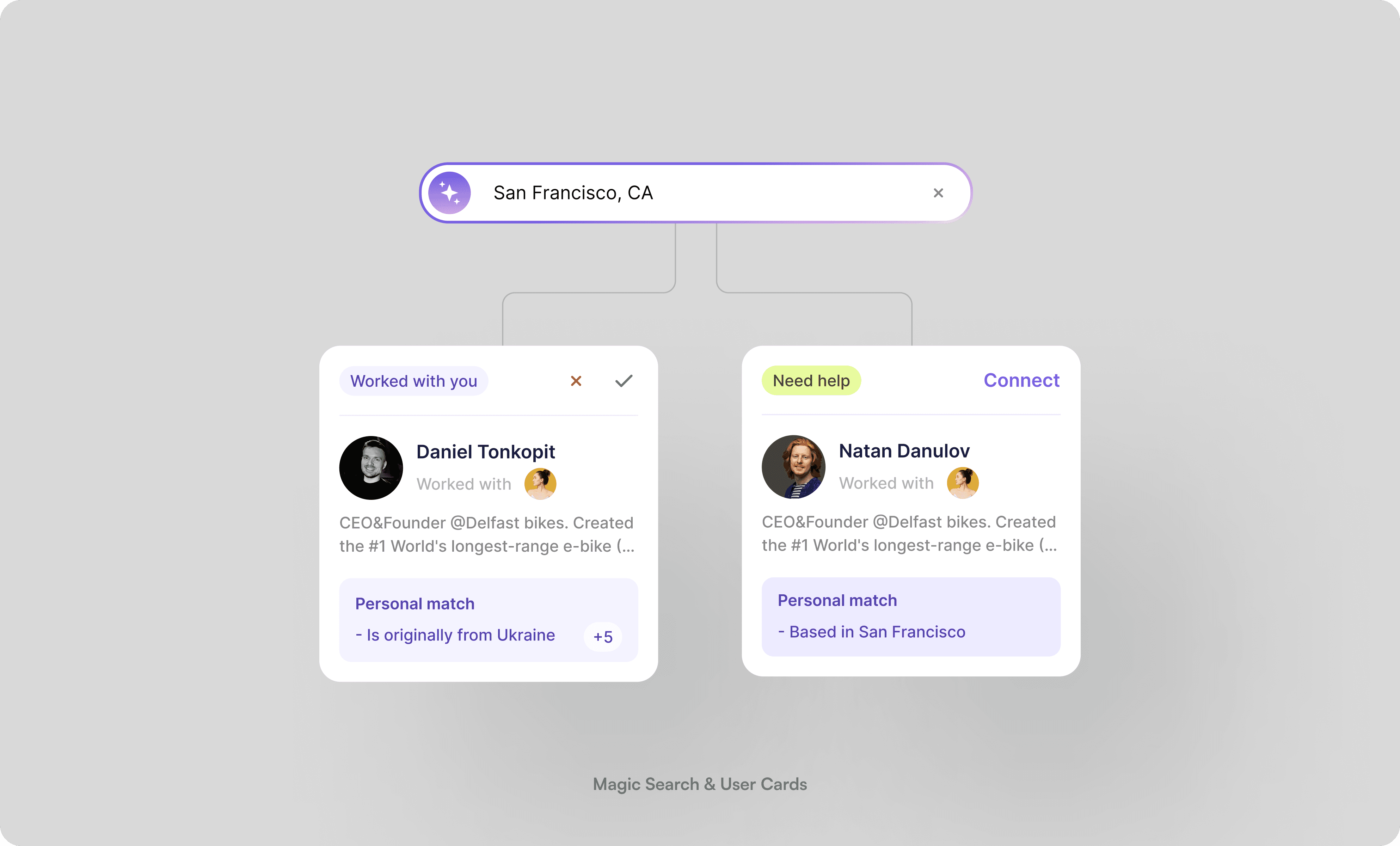
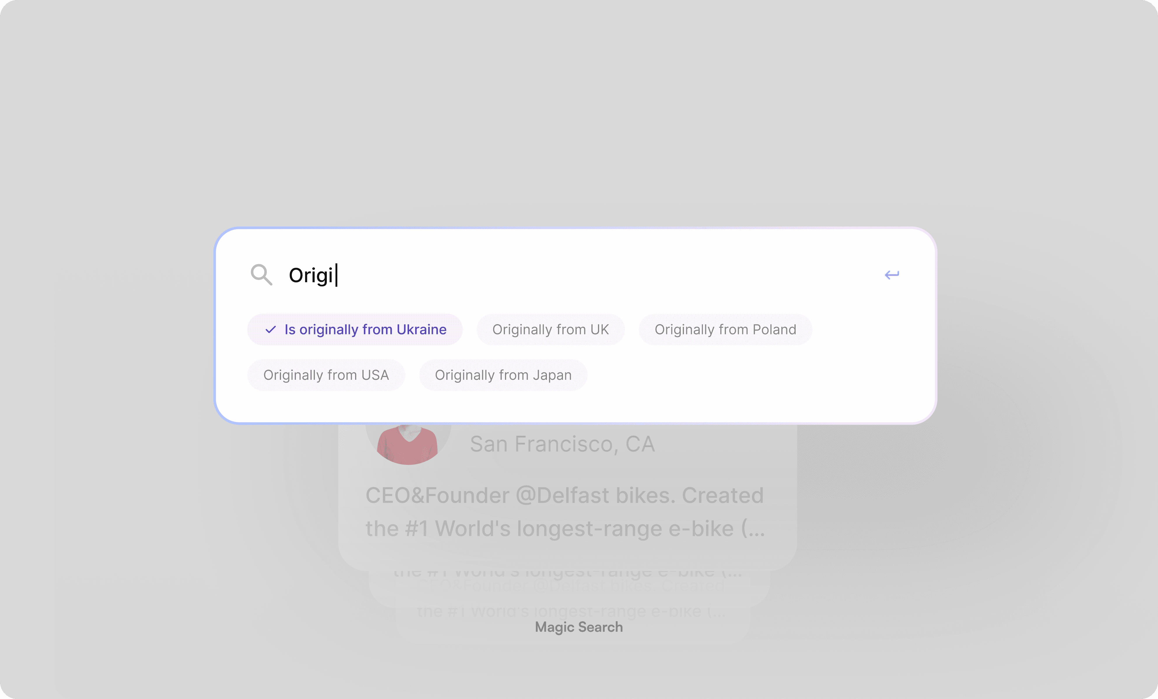
Professional profile setup screen on Kiite, displaying user bio, interests, work experience, education, and featured content with a clean, minimal UI.

🥳 User cards

We enhanced the user card with a status label, "worked with" indicator, and personal match criteria, all designed to be compact and easily adaptable for mobile.

User card for Natan Danulov with “Need help” status, brief bio, shared connection tag, and personal match label indicating Ukrainian origin, along with a “Connect” CTA.

😄 Onboarding

We streamlined the registration & onboarding process by reducing the number of steps, significantly improving accessibility and making it easier for new users to get started.

Onboarding screen with two options: create a new community or import a group chat.

Impact

🚀 Product Hunt Success

KYG was featured as Product #5 of the Day, gaining visibility among early adopters and industry professionals.

🌍 Community Growth

Over 50 new communities joined the platform, validating the improved user experience and streamlined onboarding process.

💰 Successful Investment Round

The enhancements in design and usability played a key role in securing a new round of funding, enabling further platform development and expansion.

Community page showing Jumpstart’s space with tags, member list, and owner profile.